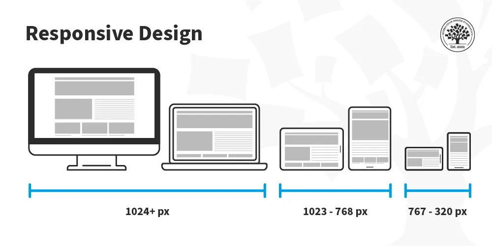
In the early days of the internet, websites were crafted for desktop computers with limited considerations for varying screen sizes. However, with the advent of mobile devices and the increasing prevalence of high-speed internet, a paradigm shift has occurred. Today, 51% of internet users access the web through mobile devices, prompting a fundamental change in the way we design and deliver content.
Enter responsive web design, a revolutionary approach that ensures websites are accessible across a spectrum of devices, regardless of their screen dimensions. This evolution in design thinking has been fueled by the need to provide a seamless user experience, irrespective of whether the user is on a desktop, laptop, tablet, or smartphone.
The Birth of Responsive Web Design:
Coined by web designer/developer Ethan Marcotte in May 2010, the term “responsive web design” signifies a unified approach to web development where the distinctions between desktop and mobile versions of a site fade away. The focus is on creating a consistent and optimal user experience, regardless of the device being used.
Media Queries: The Backbone of Responsiveness:
At the core of responsive web design are media queries. These queries are instructions to the browser, dictating which CSS styles to apply based on specific conditions. For example, when a website is accessed on a mobile device, the content may be displayed in a different manner than on a desktop.
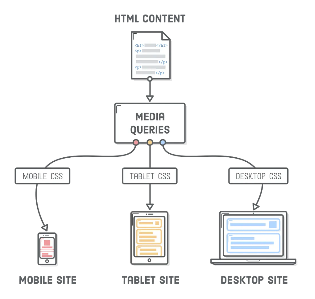
Why Use Media Queries?
- Optimized Readability and Aesthetics: Media queries allow content to be presented in a more readable and aesthetically pleasing manner. For instance, displaying a large desktop-sized image on a tiny mobile screen isn’t user-friendly.
- Tailored User Experience: Different devices warrant different layouts. Media queries enable the presentation of content in a way that is most desirable and user-friendly for each device.
- Efficient Resource Loading: Loading large files that are designed for desktops on mobile devices can be cumbersome. Media queries help optimize resource loading, reducing the strain on bandwidth and enhancing the user experience.
How to Use Media Queries:
A media query is structured as follows:
@media only screen and (max-width: 600px) {
  body {
    background-color: lightblue;
  }
}
Breaking it down:
@media: Informs the browser of an upcoming condition.only: A logical operator that applies a style only if the entire query matches.screen: Describes the general category of the device (in this case, a screen).(max-width: 600px): A media feature specifying the condition for the styles to be applied (when the width is less than 600px).body {...}: The styles to be applied when the condition is met.
In essence, media queries provide a powerful tool for crafting responsive designs that adapt to the diverse landscape of devices. As the digital world continues to evolve, mastering the art of media queries is essential for creating web experiences that cater to the needs of users across various platforms.
The Evolution of Media Queries:
Media queries have evolved to encompass a variety of features beyond just screen width. Today, designers can tailor styles based on factors such as device orientation, resolution, color capabilities, and even the type of device, allowing for a highly nuanced and personalized user experience.
@media only screen and (orientation: landscape) {
  /* Styles for landscape orientation */
}

@media only screen and (min-resolution: 300dpi) {
  /* Styles for high-resolution screens */
}
This evolution empowers developers to create interfaces that not only respond to different screen sizes but also adapt to the unique characteristics of each device.
Mobile-First Approach:
A key strategy in responsive web design is the adoption of a mobile-first approach. This entails designing and developing for mobile devices before scaling up to larger screens. By prioritizing the mobile experience, designers ensure that the most critical content and features are optimized for smaller screens, enhancing overall usability.
Practical Implementation of Responsive Web Design:
Let’s delve deeper into practical scenarios. Consider a website with a navigation bar. On larger screens, the navigation items might be displayed horizontally, while on smaller screens, they could shift to a vertical arrangement for improved touch-based navigation.
@media only screen and (max-width: 767px) {
  /* Styles for screens up to 767px wide */
  .navigation {
    flex-direction: column; /* Arrange items vertically */
  }
}

@media only screen and (min-width: 768px) {
  /* Styles for screens 768px and wider */
  .navigation {
    flex-direction: row; /* Arrange items horizontally */
  }
}
This approach ensures that the user experience is optimal regardless of the screen size, making navigation intuitive on both desktops and mobile devices.
[…] Responsive Layout using Media Queries […]
[…] Responsive Layout using Media Queries […]