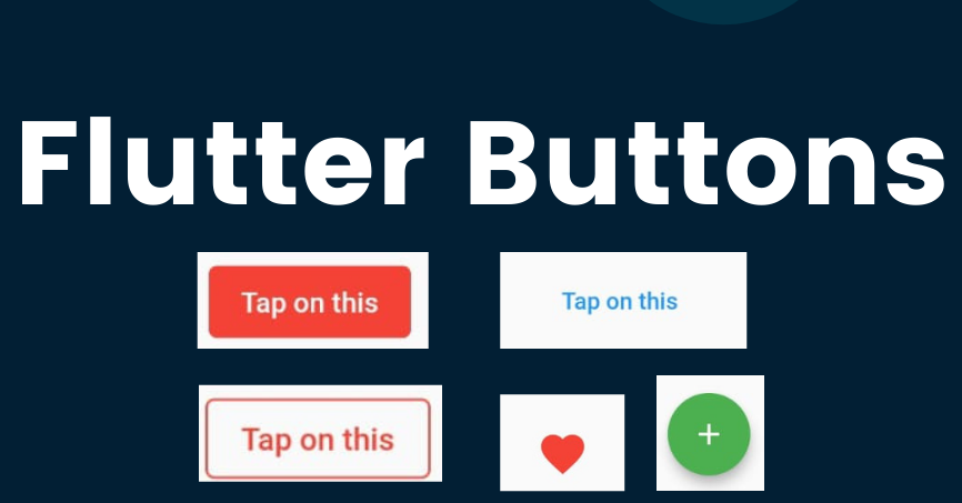
A button in Flutter can be composed of either an icon, text, or both. When a user interacts with it, it triggers a click event that performs a specific action. Flutter offers a variety of button types, each suited for different purposes. In this article, we will explore how to utilize these buttons effectively in your Flutter projects. You can go through each button type and bookmark this article for future reference. Remember, Flutter is built on widgets, and buttons are no exception. In this discussion, we will focus on six primary types of buttons.
When we are considering buttons from Flutter’s point of view, Here are some points should consider.
A button has consisted of a text or an icon
We can design a button UI using different shapes, colours, animations and behaviours.
Button also can contain it’s child widgets for different usages.
What are the Button Types in Flutter?
Flat Button
Raised Button
Floating Button
Drop Down Button
Icon Button
PopupMenu Button
Flat Button
This is the most common type. With not many customizations, It has consisted of a simple text. There have two essential properties, child and onPressed(). Then you can decorate it using its attributes(colour, text size etc.).
import ‘package:flutter/material.dart’;
void main() {
runApp(MyApp());
}
class MyApp extends StatefulWidget {
@override
_MyAppState createState() => _MyAppState();
}
class _MyAppState extends State {
@override
Widget build(BuildContext context) {
return MaterialApp(
home: Scaffold(
appBar: AppBar(
title: Text(‘Flutter Buttons – FlatButton’),
),
body: Center(
child: Column(children: [
Container(
margin: EdgeInsets.all(25),
child: FlatButton(
child: Text(
‘Button 1’,
style: TextStyle(fontSize: 20.0),
),
onPressed: () {},
),
),
Container(
margin: EdgeInsets.all(25),
child: FlatButton(
child: Text(
‘Button 2’,
style: TextStyle(fontSize: 20.0),
),
color: Colors.cyan,
textColor: Colors.black,
onPressed: () {},
),
),
]))),
);
}
}
Raised Button
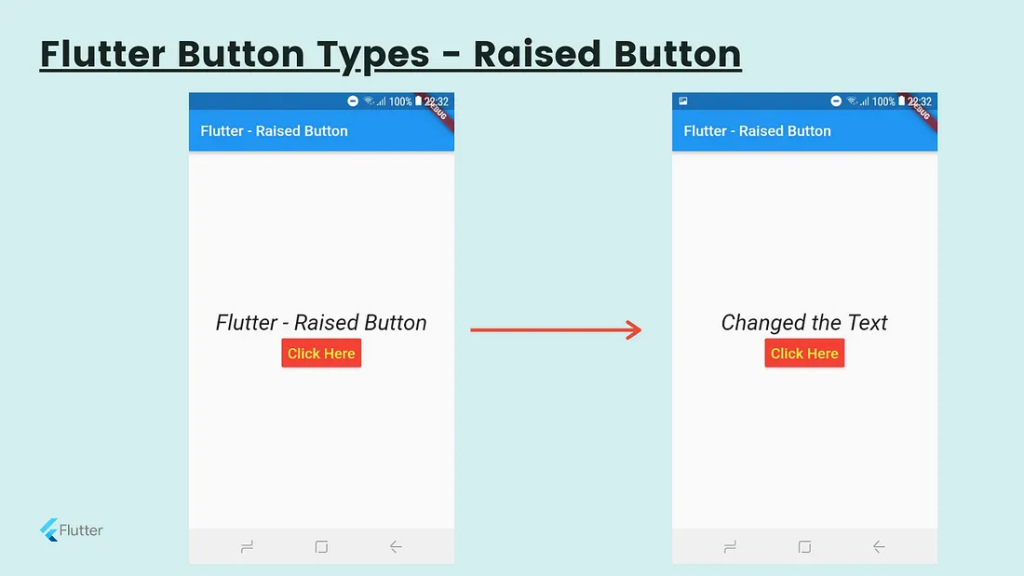
It’s also like the Flat button, but It has an elevation which is changing the size of the button on the z-axis when pressing it. In Flat buttons, there has no elevation feature. Also, there have two callback functions(onPressed() and onLongPress()). You can customize the attributes as in Flat buttons.
import 'package:flutter/material.dart';

void main() {
runApp(MyApp());
}

class MyApp extends StatefulWidget {
@override
_MyAppState createState() => _MyAppState();
}

class _MyAppState extends State {
String msg = 'Flutter - Raised Button';
@override
Widget build(BuildContext context) {
return MaterialApp(
home: Scaffold(
appBar: AppBar(
title: Text('Flutter - Raised Button'),
),
body: Container(
child: Center(
child: Column(
mainAxisAlignment: MainAxisAlignment.center,
children: [
Text(msg, style: TextStyle(fontSize: 30, fontStyle: FontStyle.normal),),
RaisedButton(
child: Text("Click Here", style: TextStyle(fontSize: 20),),
onPressed: _changeText,
color: Colors.red,
textColor: Colors.white,
padding: EdgeInsets.all(8.0),
splashColor: Colors.grey,
)
],
),
),
),
),
);
}
_changeText() {
setState(() {
if (msg == 'Flutter - Raised Button') {
msg = 'Changed the Text';
} else {
msg = 'Flutter - Raised Button';
}
});
}
}
Floating Action Button
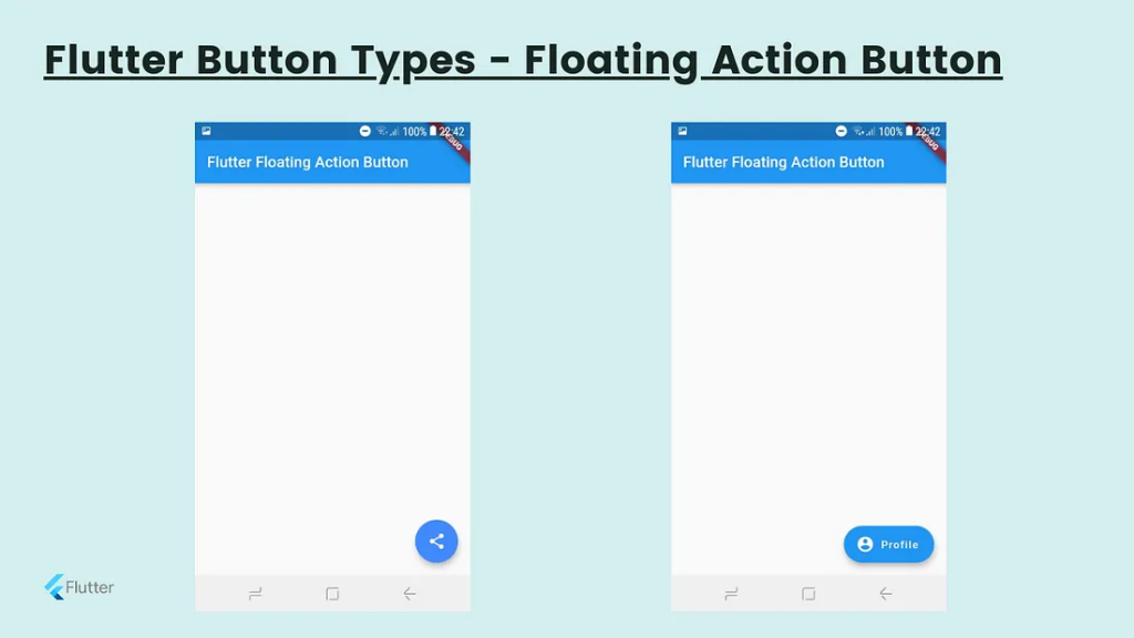
This is a special kind of button which contains under the Scaffold class. This is placed and fixed at the right bottom corner of the screen. We can use it for sharing, refreshing, adding the content.
There have two types of Floating Action Buttons.
import 'package:flutter/material.dart';

void main() {
runApp(MyApp());
}

class MyApp extends StatefulWidget {
@override
_MyAppState createState() => _MyAppState();
}

class _MyAppState extends State {
@override
Widget build(BuildContext context) {
return MaterialApp(home: Scaffold(
appBar: AppBar(
title: Text("Flutter Floating Action Button"),
backgroundColor: Colors.blue,
),
// floatingActionButton: FloatingActionButton(
// child: Icon(Icons.share),
// backgroundColor: Colors.blueAccent,
// foregroundColor: Colors.white,
// onPressed: () => {},
// ),
floatingActionButton:FloatingActionButton.extended(
onPressed: () {},
icon: Icon(Icons.account_circle),
label: Text("Profile"),
),
),
);
}
}
Drop Down Button
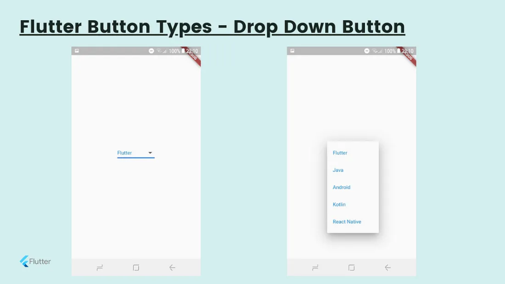
When you want to select an option from a few options, We can use this widget. I have described the drop-down list previously in detail.
Icon Button
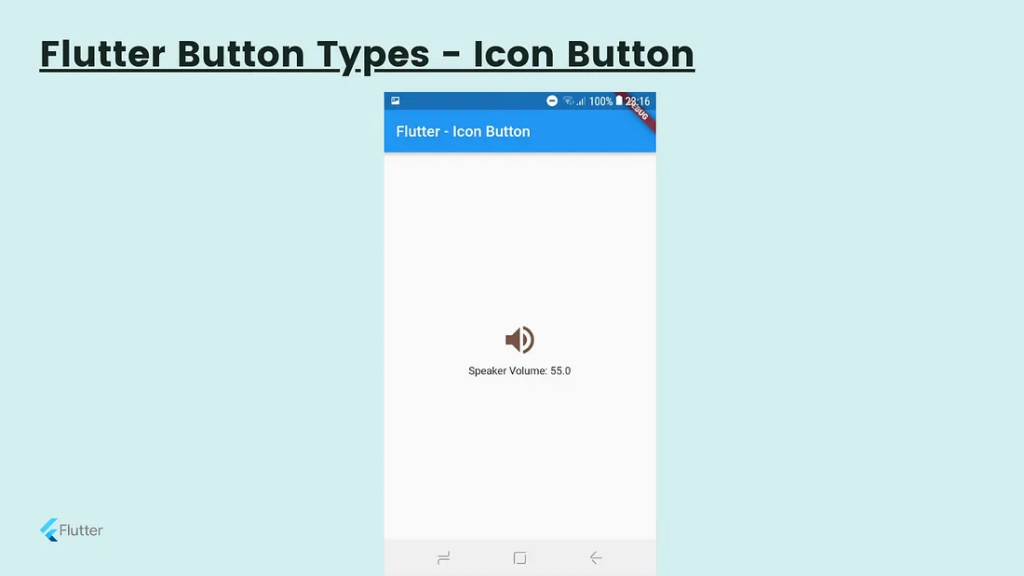
This is another type of button which is consisting of an icon than text. When you touch on the icon it will respond according to its functionality. I give you one example of a volume button icon.
import 'package:flutter/material.dart';

void main() => runApp(MyApp());

class MyApp extends StatelessWidget {
@override
Widget build(BuildContext context) {
return MaterialApp(
home: Scaffold(
appBar: AppBar(
title: Text("Flutter - Icon Button"),
),
body: Center(
child: MyStatefulWidget(),
),
),
);
}
}
double _speakervolume = 0.0;

class MyStatefulWidget extends StatefulWidget {
MyStatefulWidget({Key key}) : super(key: key);

@override
_MyStatefulWidgetState createState() => _MyStatefulWidgetState();
}

class _MyStatefulWidgetState extends State {
Widget build(BuildContext context) {
return Column(
mainAxisSize: MainAxisSize.min,
children: IconButton( icon: Icon(Icons.volume_up), iconSize: 50, color: Colors.brown, tooltip: 'Increase volume by 5', onPressed: () { setState(() { _speakervolume += 5; }); }, ), Text('Speaker Volume: $_speakervolume') ,
);
}
}
PopupMenu Button
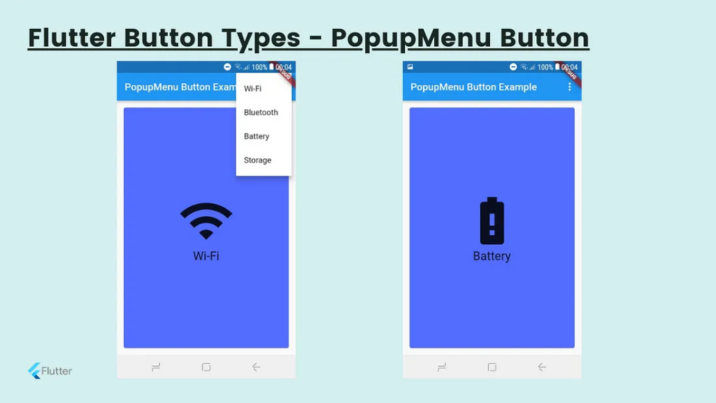
This button also has to select an option that is placed at the App bar. The App Bar is a component of Sccafold Class. Therefore PopupMenu is a sub-component of the Scaffold Widget. When the user press on it, It will call the onSelected method and the menu is dismissed. It will use with settings options mostly.
import 'package:flutter/material.dart';

void main() { runApp(MyApp());}

class MyApp extends StatefulWidget {
@override
_MyAppState createState() => _MyAppState();
}

class _MyAppState extends State {
Choice _selectedOption = choices[0];

void _select(Choice choice) {
setState(() {
_selectedOption = choice;
});
}
@override
Widget build(BuildContext context) {
return MaterialApp(
home: Scaffold(
appBar: AppBar(
title: const Text('PopupMenu Button Example'),
actions: [
PopupMenuButton(
onSelected: _select,
itemBuilder: (BuildContext context) {
return choices.skip(0).map((Choice choice) {
return PopupMenuItem(
value: choice,
child: Text(choice.name),
);
}).toList();
},
),
],
),
body: Padding(
padding: const EdgeInsets.all(10.0),
child: ChoiceCard(choice: _selectedOption),
),
),
);
}
}

class Choice {
const Choice({this.name, this.icon});
final String name;
final IconData icon;
}

const List choices = const [
const Choice(name: 'Wi-Fi', icon: Icons.wifi),
const Choice(name: 'Bluetooth', icon: Icons.bluetooth),
const Choice(name: 'Battery', icon: Icons.battery_alert),
const Choice(name: 'Storage', icon: Icons.storage),
];

class ChoiceCard extends StatelessWidget {
const ChoiceCard({Key key, this.choice}) : super(key: key);

final Choice choice;

@override
Widget build(BuildContext context) {
final TextStyle textStyle = Theme.of(context).textTheme.headline;
return Card(
color: Colors.indigoAccent,
child: Center(
child: Column(
mainAxisSize: MainAxisSize.min,
crossAxisAlignment: CrossAxisAlignment.center,
children: [
Icon(choice.icon, size: 115.0, color: textStyle.color),
Text(choice.name, style: textStyle),
],
),
),
);
}
}
[…] some-flutter-button-types-with-examples […]